
MountJoy Home and building inspection
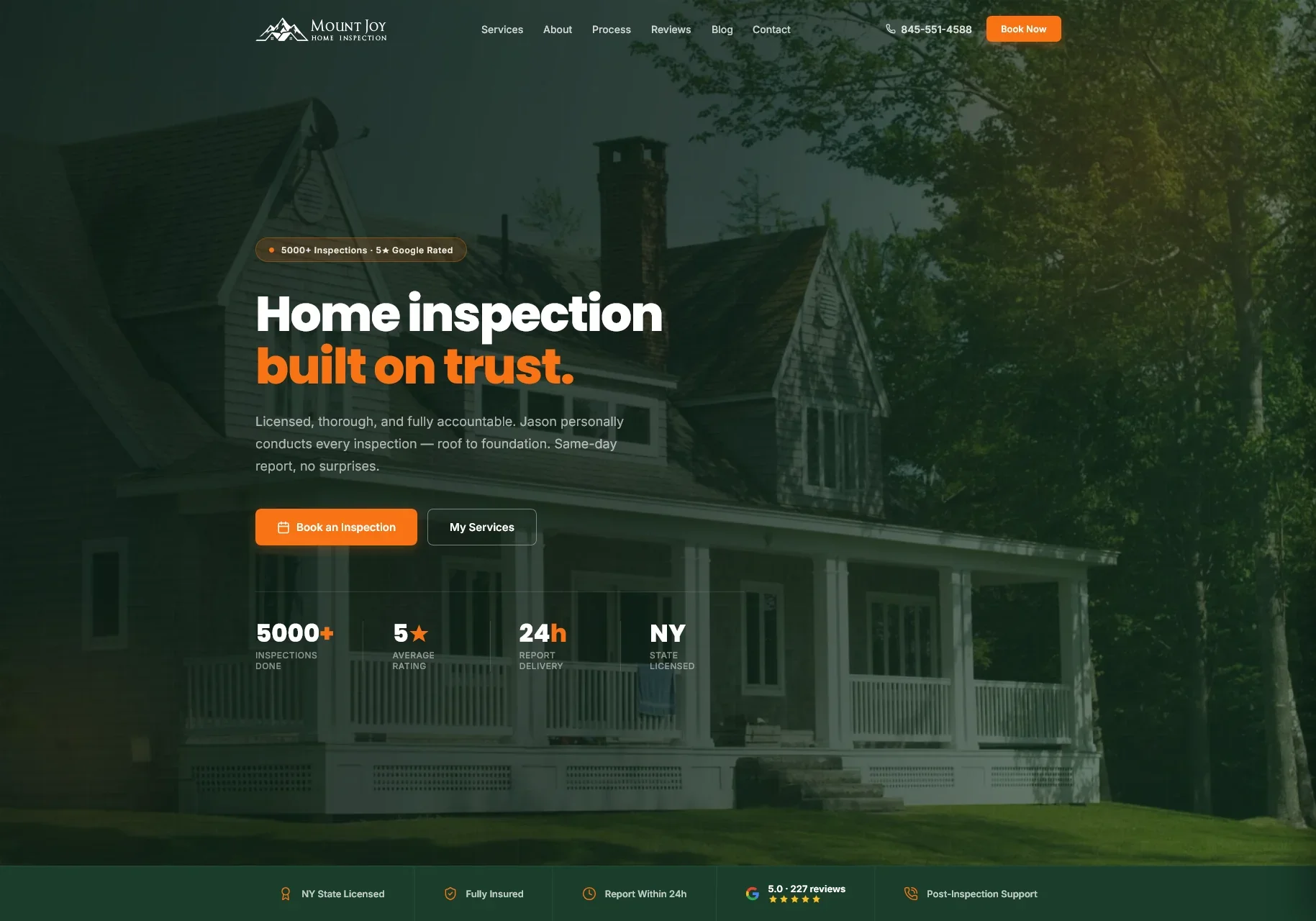
Complete overhaul of the digital identity of an approved real estate inspection professional. The project aimed to modernize the existing site, optimize the user journey and create strong visual coherence with the services offered.
- Client
- Jason French
- Year
- 2026
- Service
- Redesign · Website
- Live website
- mountjoyhomeinspection.com
Contents
Overview
The challenge
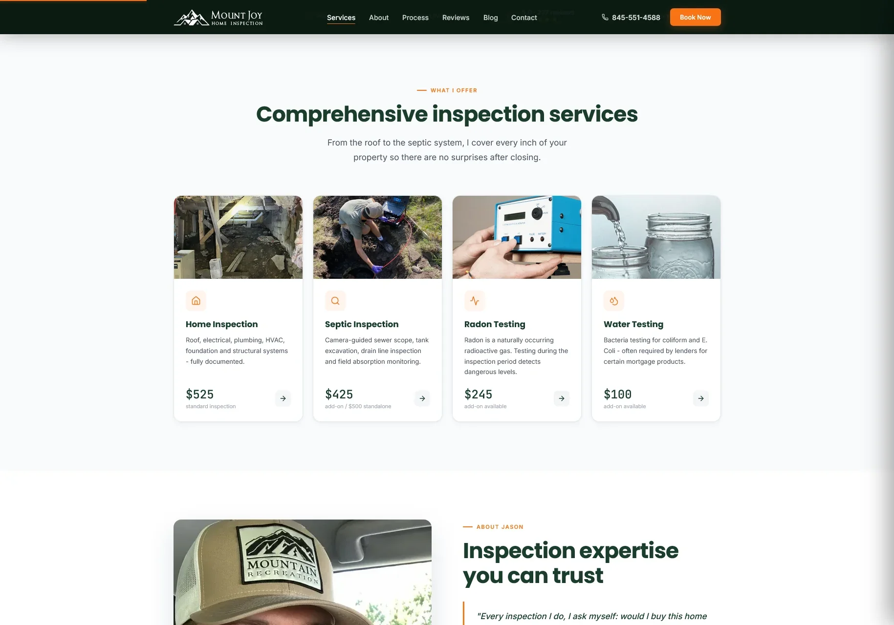
The existing site presented an aging interface, an unclear hierarchy of information and insufficient emphasis on the inspection services offered. Visitors could have difficulty quickly identifying the company's services, competitive advantages and the actions to take to request an inspection.
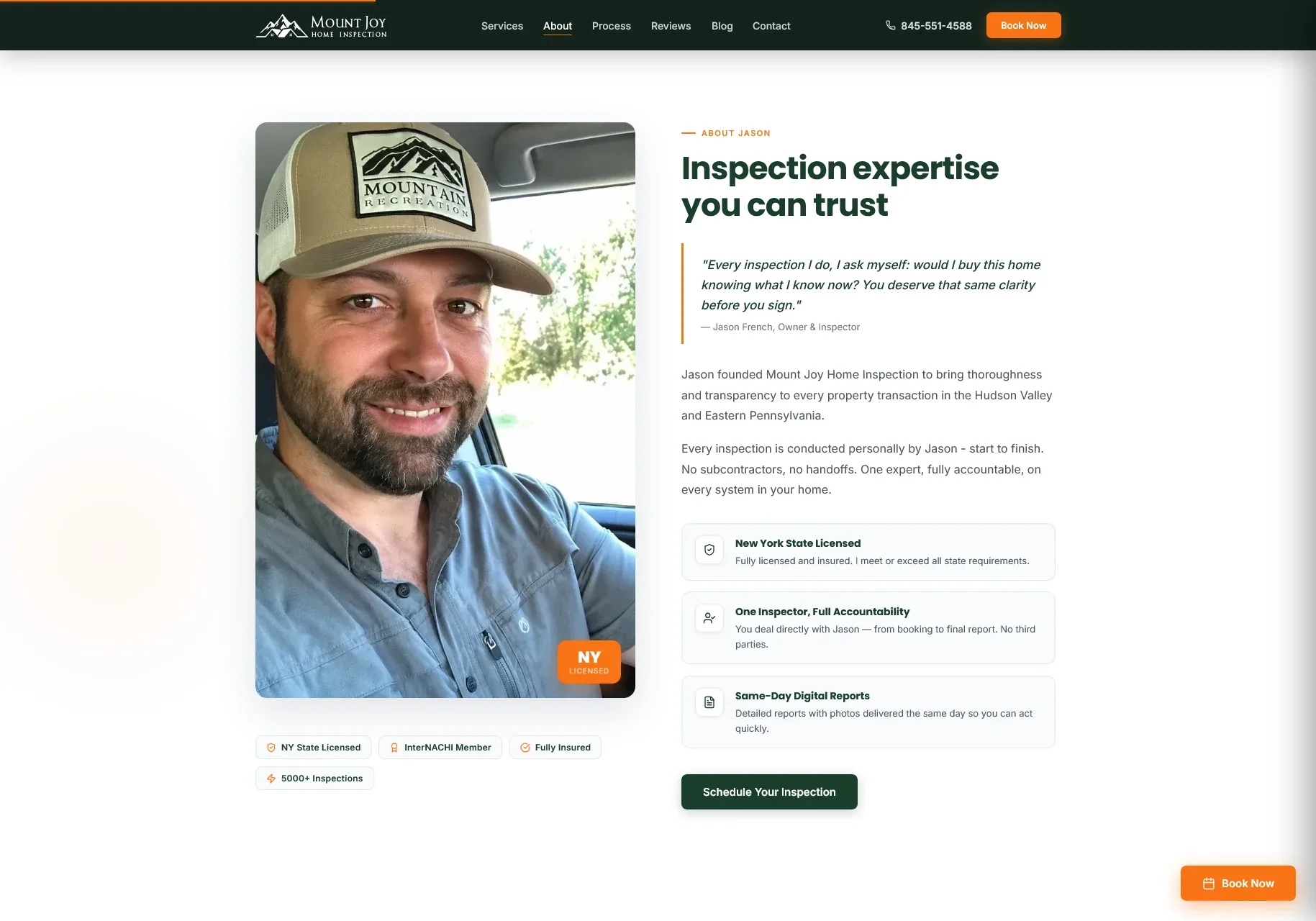
To respond to these challenges, I completely redesigned the user experience by restructuring the content, clarifying the service offering and highlighting elements of trust such as expertise, certifications and customer testimonials. The interface has been modernized with a more professional design, simplified navigation and more visible calls to action to make it easier to convert visitors into leads. Responsive optimization has also been carried out to guarantee a smooth experience on mobile, tablet and computer.
« The new website reflects my professionalism much better and allows clients to better understand my services and contact me more easily. »
- Visually dated site
- Lack of perceived credibility upon arrival on the site
- Services difficult to identify quickly
- Unintuitive user journey
- Low valuation of competitive advantages
- Risk of loss of prospects before making contact
The solution provided
I approached this redesign as an opportunity to transform an uninviting site into a real conversion tool. By restructuring the content and modernizing the interface, the objective was to better reflect the professionalism of the company and to simplify access to its services as much as possible.
- 01Modernized brand image
The visual identity of the site has been completely redesigned to reflect a more professional and contemporary positioning. The objective was to align the online image with the quality of services offered on the ground, strengthening credibility and the perception of expertise.
- 02Better understanding of services
The content has been restructured and simplified to allow visitors to quickly identify the different inspection services offered. A clear hierarchy of information makes reading easier and reduces friction in the user journey.
- 03Smoother navigation
The architecture of the site has been optimized to make navigation more intuitive. Users can now access essential information more easily thanks to a logical structure and a better guided journey.
- 04Building visitor confidence
Elements of reassurance were highlighted (expertise, experience, professionalism, structure of services) in order to strengthen the credibility of the company and encourage visitors to take action.
- 05Increase in contact requests
More visible and strategically placed calls to action have been integrated to facilitate contact. The goal was to reduce points of friction and increase the conversion rate of visitors to leads.
- 06Consistent experience across devices
The site has been fully optimized with responsive design to ensure a consistent experience on desktop, tablet and mobile. The interface now adapts perfectly to all screen formats without loss of readability or comfort of use.
The result obtained
The redesign of the Mount Joy Home Inspection site transformed an aging website into a clear, professional and conversion-oriented tool. The main objective was to strengthen the image of the company while making it easier to understand the services and make contact. The new site now offers a smoother, more reassuring experience that is better suited to user expectations in the real estate inspection sector.
- Improved readability of services thanks to a clear and hierarchical structure
- Simplified user journey with more intuitive and guided navigation
- 100% responsive experience optimized for mobile, tablet and desktop
- Strengthening perceived credibility by highlighting elements of trust
- Increased potential contacts thanks to more visible and strategic calls to action
- Better visitor retention thanks to a more modern and engaging interface
Testimonial
The new website finally reflects the level of professionalism I demonstrate in the field. It has significantly improved my online presence.
 Jason FrenchCertified Residential and Commercial Inspection Specialist (United States)★★★★★
Technical stack
Screenshots
Have a similar project in mind?
Let's discuss your needs. I'll reply within 48 hours with a detailed, no-commitment and no-hidden-fees quote.